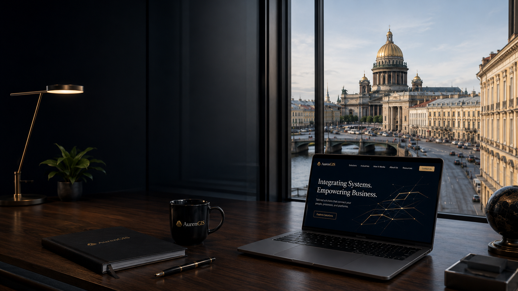
/* ========================================================= AURENGIS HOME Blueprint: - Premium dark hero - Left-aligned editorial copy - Real photographic background - Ivory services section ========================================================= */ /* ========================================================= HERO ========================================================= */ .hero-section { position: relative; min-height: calc(100dvh - var(--header-height)); display: flex; align-items: stretch; overflow: hidden; background: #06101a; } /* ========================================================= HERO IMAGE ========================================================= */ .hero-media { position: absolute; inset: 0; overflow: hidden; } .hero-image { width: 100%; height: 100%; object-fit: cover; /* Keep the city and architecture visible on desktop, while leaving the left side darker for the copy. */ object-position: center center; transform: scale(1.002); } /* ========================================================= HERO OVERLAY ========================================================= */ .hero-overlay { position: absolute; inset: 0; background: linear-gradient( 90deg, rgba(3, 11, 19, 0.98) 0%, rgba(4, 13, 22, 0.96) 28%, rgba(5, 15, 25, 0.80) 45%, rgba(5, 15, 25, 0.24) 64%, rgba(4, 12, 20, 0.02) 100% ), linear-gradient( 180deg, rgba(2, 8, 14, 0.12) 0%, rgba(2, 8, 14, 0) 45%, rgba(2, 8, 14, 0.18) 100% ); } /* ========================================================= HERO CONTENT ========================================================= */ .hero-content { position: relative; z-index: 2; min-height: calc(100dvh - var(--header-height)); display: flex; align-items: center; padding-top: clamp(56px, 7vh, 90px); padding-bottom: clamp(72px, 9vh, 115px); } .hero-copy { width: min(620px, 47vw); } /* ========================================================= HERO TITLE ========================================================= */ .hero-title { margin: 0; max-width: 650px; color: #f7f4ed; font-family: Georgia, "Times New Roman", Times, serif; font-size: clamp(54px, 5.5vw, 88px); font-weight: 400; line-height: 0.98; letter-spacing: -0.045em; text-wrap: balance; } .hero-title-accent { display: inline-block; margin-top: 10px; color: var(--color-gold-light); } /* ========================================================= HERO DIVIDER ========================================================= */ .hero-divider { width: 82px; height: 3px; margin-top: 34px; margin-bottom: 30px; background: linear-gradient( 90deg, var(--color-gold-light), var(--color-gold) ); border-radius: 99px; } /* ========================================================= HERO DESCRIPTION ========================================================= */ .hero-description { max-width: 560px; margin: 0; color: rgba(240, 241, 242, 0.82); font-size: clamp(17px, 1.2vw, 20px); font-weight: 350; line-height: 1.7; letter-spacing: -0.012em; } /* ========================================================= HERO BUTTONS ========================================================= */ .hero-actions { display: flex; align-items: center; gap: 22px; margin-top: 38px; flex-wrap: wrap; } /* ========================================================= SERVICES SECTION ========================================================= */ .services-section { position: relative; background: linear-gradient( 180deg, #faf8f4 0%, #f7f4ee 100% ); padding: clamp(48px, 5vw, 74px) 0 clamp(64px, 6vw, 92px); border-top: 1px solid rgba(0, 0, 0, 0.04); } /* ========================================================= SERVICES GRID ========================================================= */ .services-grid { display: grid; grid-template-columns: repeat(3, minmax(0, 1fr)); gap: clamp(24px, 2.2vw, 34px); } /* ========================================================= SERVICE CARD ========================================================= */ .service-card { position: relative; min-height: 410px; display: flex; flex-direction: column; padding: clamp(34px, 3vw, 46px) clamp(28px, 2.6vw, 40px); background: linear-gradient( 145deg, rgba(255, 255, 255, 0.96) 0%, rgba(250, 247, 241, 0.97) 100% ); border: 1px solid rgba(65, 52, 34, 0.09); border-radius: 7px; box-shadow: 0 14px 34px rgba(27, 23, 17, 0.05), 0 3px 8px rgba(27, 23, 17, 0.025); transition: transform var(--transition-normal), border-color var(--transition-normal), box-shadow var(--transition-normal); } .service-card:hover { transform: translateY(-5px); border-color: rgba(164, 118, 52, 0.22); box-shadow: 0 20px 44px rgba(27, 23, 17, 0.09), 0 5px 12px rgba(27, 23, 17, 0.035); } /* ========================================================= SERVICE ICON ========================================================= */ .service-icon { width: 68px; height: 68px; display: inline-flex; align-items: center; justify-content: center; margin-bottom: 26px; color: #a87632; border: 2px solid rgba(168, 118, 50, 0.78); border-radius: 3px; font-family: "Courier New", Courier, monospace; font-size: 23px; font-weight: 600; line-height: 1; } /* The second icon is intentionally more circular to visually resemble an integration/network node. */ .service-card:nth-child(2) .service-icon { border-radius: 50%; font-family: Georgia, serif; font-size: 32px; } /* Automation card: no outer box feel, closer to the reference gear treatment. */ .service-card:nth-child(3) .service-icon { border: 0; width: auto; height: auto; justify-content: flex-start; font-size: 60px; font-family: Arial, sans-serif; font-weight: 300; } /* ========================================================= CARD TITLES ========================================================= */ .service-card h2 { margin: 0; color: #131c29; font-family: Georgia, "Times New Roman", Times, serif; font-size: clamp(30px, 2.3vw, 39px); font-weight: 400; line-height: 1.08; letter-spacing: -0.035em; } /* ========================================================= CARD DIVIDER ========================================================= */ .card-divider { width: 42px; height: 2px; margin-top: 20px; margin-bottom: 22px; background: #a87430; } /* ========================================================= CARD BODY ========================================================= */ .service-card p { margin: 0; max-width: 390px; color: #646770; font-size: clamp(15px, 1vw, 17px); line-height: 1.65; } /* ========================================================= CARD LINK ========================================================= */ .card-link { display: inline-flex; align-items: center; gap: 10px; width: fit-content; margin-top: auto; padding-top: 30px; color: #9b6a2a; font-family: Georgia, "Times New Roman", Times, serif; font-size: 17px; transition: color var(--transition-fast), transform var(--transition-fast); } .card-link::after { content: "→"; font-family: Arial, sans-serif; transition: transform var(--transition-fast); } .card-link:hover { color: #704819; } .card-link:hover::after { transform: translateX(4px); } /* ========================================================= LARGE DESKTOPS ========================================================= */ @media (min-width: 1600px) { .hero-copy { width: 670px; } .hero-title { font-size: 90px; } .hero-description { max-width: 590px; font-size: 20px; } .service-card { min-height: 430px; } } /* ========================================================= LAPTOPS / SMALL DESKTOP ========================================================= */ @media (max-width: 1250px) { .hero-copy { width: min(610px, 54vw); } .hero-title { font-size: clamp(50px, 5.5vw, 72px); } .hero-description { max-width: 520px; } .hero-overlay { background: linear-gradient( 90deg, rgba(3, 11, 19, 0.99) 0%, rgba(4, 13, 22, 0.95) 34%, rgba(5, 15, 25, 0.73) 53%, rgba(5, 15, 25, 0.12) 76%, rgba(4, 12, 20, 0.02) 100% ); } .service-card { min-height: 390px; } } /* ========================================================= TABLET ========================================================= */ @media (max-width: 1050px) { .hero-section, .hero-content { min-height: 760px; } .hero-image { object-position: 61% center; } .hero-overlay { background: linear-gradient( 90deg, rgba(3, 11, 19, 0.99) 0%, rgba(4, 13, 22, 0.96) 42%, rgba(5, 15, 25, 0.76) 60%, rgba(5, 15, 25, 0.25) 82%, rgba(5, 15, 25, 0.08) 100% ), linear-gradient( 180deg, rgba(2, 8, 14, 0.08), rgba(2, 8, 14, 0.15) ); } .hero-copy { width: min(590px, 66vw); } .hero-title { font-size: clamp(48px, 7vw, 68px); } .services-grid { gap: 22px; } .service-card { padding: 32px 26px; min-height: 370px; } .service-card h2 { font-size: clamp(27px, 3vw, 34px); } } /* ========================================================= MOBILE / TABLET PORTRAIT ========================================================= */ @media (max-width: 820px) { .hero-section { min-height: auto; display: block; } .hero-media { position: relative; height: clamp(390px, 64vw, 560px); } .hero-image { object-position: 66% center; } .hero-overlay { background: linear-gradient( 180deg, rgba(3, 11, 19, 0.12) 0%, rgba(3, 11, 19, 0.1) 38%, rgba(3, 11, 19, 0.58) 72%, rgba(3, 11, 19, 0.98) 100% ); } .hero-content { min-height: 0; margin-top: -1px; padding-top: 48px; padding-bottom: 62px; background: linear-gradient( 180deg, #06101a 0%, #071522 100% ); } .hero-copy { width: 100%; max-width: 650px; } .hero-title { font-size: clamp(44px, 9vw, 62px); line-height: 1.01; } .hero-description { max-width: 620px; font-size: 17px; line-height: 1.65; } .hero-actions { margin-top: 32px; } .services-grid { grid-template-columns: 1fr; } .service-card { min-height: 0; } .service-card p { max-width: 520px; } .card-link { margin-top: 26px; padding-top: 0; } } /* ========================================================= MOBILE ========================================================= */ @media (max-width: 560px) { .hero-media { height: 355px; } .hero-image { object-position: 70% center; } .hero-content { padding-top: 36px; padding-bottom: 48px; } .hero-title { font-size: clamp(39px, 11.5vw, 52px); } .hero-title-accent { margin-top: 8px; } .hero-divider { width: 64px; margin-top: 27px; margin-bottom: 24px; } .hero-description { font-size: 16px; line-height: 1.62; } .hero-actions { width: 100%; display: grid; grid-template-columns: 1fr; gap: 13px; margin-top: 30px; } .hero-actions .primary-button, .hero-actions .secondary-button { width: 100%; } .services-section { padding-top: 34px; } .service-card { padding: 30px 24px 28px; } .service-card h2 { font-size: 31px; } } /* ========================================================= SMALL MOBILE ========================================================= */ @media (max-width: 390px) { .hero-media { height: 320px; } .hero-title { font-size: 38px; } .hero-description { font-size: 15px; } .service-card h2 { font-size: 28px; } }